Website 1: Amazon
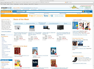
This is a shopping website, offering a wide range of products. It has a shopping cart and plenty of guides to point you in the right direction. You can refine your product search several times until you find the exact item you require.
The design is functional rather than aesthetically pleasing. However, the layout is clear, if a bit cluttered.
Amazon has a very broad target audience. I think it is designed to be as inclusive as possible. It is very easy to navigate. There are links, drop down menus, and search bars and buttons across the top and sides. It needs no additional software.
I think it could be improved by being less cluttered.
Website 2: XFM Manchester
The website is intended to provide music news and reviews for xfm radio listeners, an indie music station. There is plenty of information on the website, but it makes little effort to look interesting or appeal to teenagers who will be the majority of its audience. If it wasn't for the ugly green boarder it could be an ordinary newspaper site.
You can click on photographs, drop down menus, and hyperlinks in the text to navigate. To access some parts you need to register your details and have Realplayer. The content is fine, but I think considering it is aimed at teenagers, it is a bit dull. I would try to make the overall look and layout more modern.
Since I made this entry, the website layout has been updated, see below.
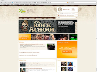
I think this looks far better! It is stylish and uncluttered, and has a nice rough and ready quality which you associate with the indie music that the station plays.
Website 3: The Designer's Republic
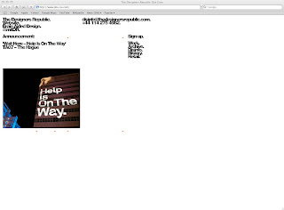
This is for a leading graphic design company with a portfolio of famous clients. The website contains information relevant to its purpose, but I think it has some drawbacks. It is very minimalist, to the point where it is misleading and confusing. The layout is a bit odd, and you would have to use it regularly to get used to it.
It will be aimed at design clients and other designers, so it is obvious the company has tried not to have a run of the mill website. However, I think they have sacrificed cutting edge design for usability. It is slow, sometimes links don't seem to work, and you are not always sure where you are. You need Flash, which loads very slowly and sometimes not at all. Overall, I think this needs to be made quicker and clearer to use.
Website 4: Sara Fanelli
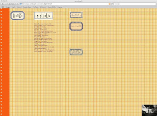
This website is for the illustrator Sara Fanelli. It contains relevant information about who she is and a portfolio of her work. It features a distinctive wallpaper background and hand lettered text, which I think makes it very personal and individual. It is aimed at publishers and advertisers, and shows clearly the type of work Fanelli produces; mostly hand rendered illustrations. It is very easy to navigate, but the layout is still different and interesting. You don't need any special software to view it. I think this is an excellent website and I wouldn't change anything.
Website 5: The Robin Hood Inn

This website was design to provide potential customers with information about the Inn, such as location, menu, and opening times. It provides all this information clearly with well laid out photographs.
The layout is very simple, but I think it is effective. I particularly like the banner photograph across the top with lettering over the right hand side, which is set off nicely by the dark red background. As the Inn is in the Peak District, the target audience would be tourists, probably car drivers in the 35-65 age bracket. It would also be a useful stopover for hikers wanting B&B. I think the website is effective in appealing to this category of people, because they would be expecting something straightforward and user friendly, rather than a lot of flashy graphics, which would sit oddly with a country pub.
The navigation is easy, with a button table on the left hand side, and extra links within the text. The site is well connected, with some nice rollover images in the accommodation section. You don't need extra software/plugins or to join any networks to access information. To improve the site, I think I would experiment with some more interesting fonts, especially across the top banner.
Website 6: Bluu Bar & Restaurant
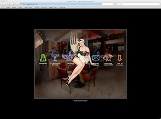
I have chosen this site for a trendy bar in Manchester's Northern Quarter as a contrast to the country pub. The purpose of this website is to provide information for potential customers and employees. It does this and also acts as a showcase for the Bluu chain, which has bars across the UK. It has all the details you would expect such as menus, location, opening hours, phone numbers, etc.
This is one of the most distinctive websites I have seen. The bar describes its look as 'an eclectic mix of retro furniture and 80's styling', with lived in values that does not take itself too seriously. This is reflected in the style of the website, which on the opening page has a black background, with a window of faded floral wallpaper. In the centre of this window the Bluu logo appears, complete with wavering animation, old style film 'crackle' and fuzzy sound effects. The home page for each location features a 1950's retro style illustration of a pin-up girl perched on a table with a giant fork. each link has its own neon symbol.
The website is designed to appeal to the young, urban customers, who are likely to be image conscious and media savvy, and will be amused by the quirky aesthetic. However, I think this site has a number of drawbacks. each link takes several seconds to load which is off putting, and you need to click twice- the first click just makes the symbol flash and buzz, which is really annoying. Also, when you click the menu page, it opens as a photograph of the dining area, and you then have to roll the mouse over the menu set on one of the tables for food, a glass at the bar for drinks etc. It took me a few seconds to realize this, and if you were in a hurry you might give up. when you finally get the menu up, you have to turn the pages by dragging the mouse across the corner. Some bits open in different windows, and the obscure, slow links make it difficult to navigate. It may not work on all types of computer.
I was impressed with the unusual aesthetic, but I think this is over designed with too many gimmicks, and overall the effect is quickly irritating. I would tone down the sound effects, animation and obscure links to make it quicker and easier to navigate.
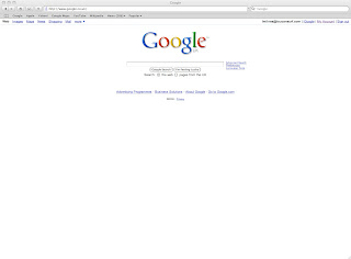
The Google website is essentially an internet search engine, and it tries to stick to this purpose with its design. As it has grown in popularity and versatility, many other features have been added, such as maps, mail, news etc, but this have been kept to unobtrusive links on the top left of the page. The main feature is simply the logo and the search bar, making the page as easy to navigate as possible.
This simplicity makes the page very suitable for its purpose, and it is also memorable, as most websites have very little white space. It is probably so familiar to most people that they don't really look at it, but Google occasionally challenge this when they produce a one-off customized logo for special events. This use of humour and responding to the times makes it seem less of a giant faceless organization. Even so, some people would probably prefer less minimalism. Google needs to appeal to as broad a range of people as possible, so it probably takes care not to exclude or alienate anyone with complex navigation- the more specialized tools are there for those who need them.
I would suggest that some of the features, such as news and shopping, are a bit too discreet, as I rarely think about using them, even though I look at other news and shopping sites.
Website 8: Yahoo!
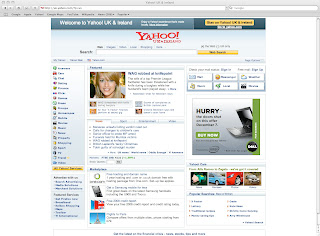
The Yahoo site is a rival search engine to Google, but it takes a different approach to layout. The search bar is just one feature at the top portion of the page, while the rest is crammed with links and advertisements. It is quite clear and usable; I think its main fault is that it is not particularly distinctive or memorable, and looks just like almost all others sites of this kind. It is aimed at the general internet user; I don't think its core audience could be easily narrowed down.
The site has a wide variety of navigation tools, such as tabs, tables, buttons, drop down boxes, and picture links. There is so much information competing for your attention that it is difficult to take in. I think you would have to use it regularly to find your way around quickly. A lot of links take you straight into completely separate websites. You need an account to access some areas, and Realplayer for others. I would make the overall look of this site more distinctive and less busy.
Website 9: Apple
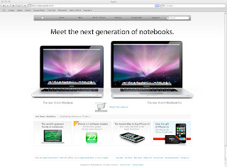
The Apple website is a showcase for Apple's products and services, from which you can order items and download a variety of music, videos. etc. It is designed to reinforce the Apple branding, using the white and brushed steel that is used for their computers. The Macs are all displayed with the distinctive purple aurora desktop, which emphasizes the visual quality of their computers. Although there is a lot of information on each page, it doesn't look crammed, and doesn't shout at the viewer.
The website will be used by people who are design and technically literate, as well as young music fans downloading music. The overall impression is of a sleek and modern website which reflects its products, and should appeal to its users. It is well laid out with a large navigation bar and no overly obscure links or unnecessary gimmicks. I couldn't make some of the animated tutorials work, and the pages take a few seconds to load, which makes it less browsable. I think some of the iTunes/iPod pages which will be used by a lot of teenagers could be made a bit less bland.
Website 10: Macclesfield Council
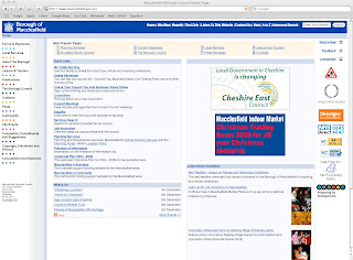
The website is designed to provide information to Macclesfield citizens about the council's services. There is plenty of material to this purpose. The main reason I have included it is because it is the only site I have seen which offers a variety of alternatives to its standard layout, which aims to include all types of users. For example, you can look at a text only version, you can magnify the site, and also play an audio version (although only in Internet Explorer). The site is clear and easy to navigate. Its design is formal and business-like, because it is a public service rather than a site to sell or promote products.
Although it is good to see a website which is inclusive of partially sighted users, this service is limited to users of Windows Internet Explorer, so it could be improved by being usable in all browsers.