Saturday 17 January 2009

Evaluation


During this unit, I have learned how to design and build a website, and also add an animation and interactivity.   I now feel confident in using Dreamweaver and preparing documents in Photoshop, Image Ready and Illustrator for web.  

I have explored various aspects of designing graphics for web, and experimented with a range of different designs.   From the research I carried out, I gathered that the main principles of web design are to create a site that is attractive and memorable, but also as user friendly as possible.  Ways to achieve this include not overloading it with graphics that are slow to load, not cramming too much information on one page, and making the navigation simple to follow.  The first question to ask is what is the purpose of the site?  In my case it was to create a portfolio of my current design work.   The next question was who will the audience be?
This would be potential clients, college tutors, agencies and employers.  Therefore I decided to create a site that presented a wide range of my strongest work, in a way that was clear and memorable.   

On the whole, I think I have achieved my aims.  I felt that the final choice of graphics was suitable because the compass worked well on the page, but also communicated something about the purpose of the page- a navigation tool.  One area which I could possibly have improved on was the size of some of the displayed work.  Particularly in the Graphic Narrative section, the images are a bit on the small side to view the work in detail.  If I had more time, I would have introduced a 'click to enlarge' feature, or even made certain images open in a separate window.  This is something I could think about doing in the future.  I didn't experience many technical difficulties in building the site, so maybe I could have introduced some more complex features.

When I uploaded the site to a browser, the link at the bottom right corner of the index page was missing.

(below)


Also the illustrated book page had all its images missing. (below.)   I thought this was because I had saved some of the images with capital letters as filenames.  Therefore I needed to correct this and upload the site again.   However, the corrected version still didn't work and unfortunately there wasn't time to retry.   There was also a problem with the video which worked in the preview but not once uploaded.

Besides this problem, the rest of the website worked OK in Camino, Safari, Opera and Internet Explorer. 


I have learned a lot about the internet and the world wide web through all the reading and research I have done, especially about dot-com businesses and internet security, which will be useful to know in the future.  


Tuesday 6 January 2009

Technical details


(Please see paper version in folder of this section)

Once I had organized my designs and layout, I began to build the website.  The first step was to save each element of my design for web.  This converts the file from whatever format it is in to a GIF file, which is compatible for web graphics.  This is because the GIF file breaks the colour down into a lower amount of groups, making the file smaller.   The lower the colour groups, the more likely you are to loose some of the quality of the image.  However, it also means that the image will take less time to load in the browser.   I reduced the compass image on my index page from over 200 in Photoshop to 16 in the GIF.   There was some loss of quality, but I felt it was minor, compared to the advantage of a site which loaded quickly.  

I repeated this process for each graphic element of my website.  I made sure that I created my  Photoshop graphics on separate layers so that I wouldn't encounter any problems with adapting them for a website.  

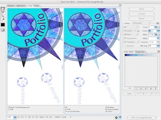
Below:  Saving a Photoshop file for web


The next step was to create the rollover buttons.  These are the links to each category of the site on the index page, and also in the submenus on each page.   The rollover effects makes each link change colour when the mouse is passed over it.  To do this, I saved two versions of each link for web, one as the original colour and one as a lighter version.   It is very important to save the buttons at exactly the same size, otherwise the images will be unclear and the rollover will be ineffective.

Below: saving rollover buttons


I have now prepared all my images,  and made sure that they were all saved in a separate folder.  The next step is to define the site in Dreamweaver.  This is an XHTML based software, which is fully inclusive and does not require plug-ins.  The other main kind of website software is Flash.  this is more animated graphics based than XHTML software, but does not work on all platforms and may take a long time to load.

 I defined my site by choosing Site> Manage Sites>New>Site.  I selected the Basic tab, named the site portfolio and clicked next.  I then selected No I do not want to use a server technology and clicked next.  I selected the edit local copies on my machine button and clicked the yellow folder icon to the right of the text box.  I navigated to my portfolio folder which was located in My Documents and and clicked Select and then Next.   Under the question How do you connect to the remote server I selected None from the drop down menu.   I then clicked Next and Done.

To create documents within the site, I selected File>New.  I then selected the General tab from the top and selected HTML from the page type window, and none from the Layout window.  I selected the doc type as XHTML and clicked Create.  I created a separate page for each section of my site.  

In Dreamweaver, the drag and drop commands allow you to create sites without any knowledge of HTML.  However,  you can view the code with a split screen view.  Although I used the drag and drop commands to build my website, I kept the split screen view open so I could gain a basic understanding of how the code works.  The code is known as XHTML tags.  The opening tag and the closing tag contain the letters html.  In between these two tags, is the header and the body.  The header contains information that doesn't appear on the page itself, like the title.  The body contains the text and graphics that appear on the page.

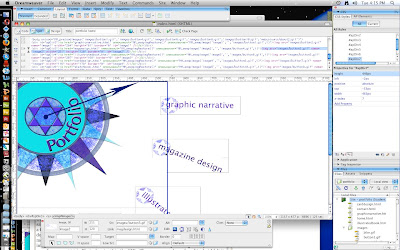
To add an image to my first page, the index page, I selected the layout category in the Insert bar, and selected Draw AP Div (second from the left.)   This tool allows you to draw an image box of any size on the page.  Once the box is drawn, the image can be added to the box by selecting the Common category in the Insert bar, and then the Image Icon.  

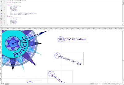
Below: the code showing the first div tag, where the main compass graphic has been added.


To add the rollover buttons, I followed the same process, but chose the rollover option from the drop down box to the right of the Image Icon.  To make sure the process had worked, I clicked File>Save>Preview in Browser> Camino/Safari etc.  This opened the page in the selected browser and I was able to roll the mouse over each link to make sure that they changed colour.  

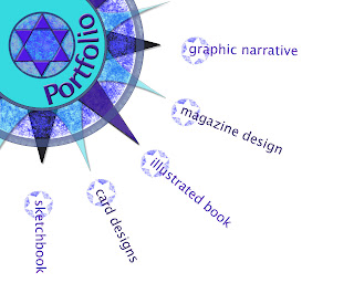
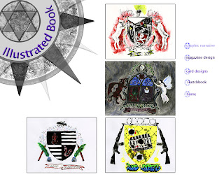
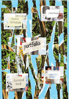
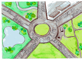
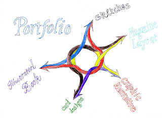
I created a new page for each category of my website, eg.  Graphic Narrative, Card Designs, Sketchbook, Illustrated Book, and Magazine Design.   I added the images and the rollover buttons in the submenu in the way described above.

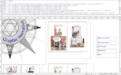
Below: The code showing the div tags and images for the Graphic Narrative page.


The next step was to create the links between the pages.  This was done by highlighting the text and image that I wanted to link.  In the property inspector (located at the bottom of the dreamweaver screen)  I entered the name of the file I was linking to- eg. carddesigns.html  - in the link text box.  I repeated the process for each link in each page, making sure that all the submenus were also linked.


A quicker way of linking documents is to use the Point to File icon.  As before, you highlight the text or image that you want to link, and then click on the target icon to the right of the link text box.  Holding down the mouse button, drag the pointer to the required file in the files panel and release the mouse button.  This automatically adds a link in the text box.  

The next thing I did was to add an animated image.  I prepared the image in Image Ready.   Using the line tool to create arrowheads, I drew a series of long arrows to create a needle around the centre of the compass, making sure that each arrow was on a separate layer and placed a short distance underneath the previous one.  Then, using the animation facility at the bottom of the page, I added a frame for each position of the arrow, using the eye tool to hide the other arrows.  Once each frame had been added, I set them to play at one second apart, to create the impression of a needle moving around the compass.  I set it to play once, rather than on a continual loop, because I think on the index page where I am going to put it, it will become distracting if looped.   Finally, I added it to Dreamweaver by selecting Save Optimized as  and saving it my web folder.  I was then able to replace the un-animated compass on my index page with the animated one.   I saved it and previewed it in a browser, and it works as it should, with the needle moving around the compass once each time the page opens.  


Below:  creating an animated image in Image Ready


The final stage was to add a feedback form, where users could fill in boxes and send it to an email address.   This was done by choosing the Form option from the insert menu.  A red border appeared which marked the boundaries of the form.   To set the properties so that the form can process the data it receives, I added mailto: followed by my college email address in the action field.  I made sure that the method field was set to POST.  This allows the data to be collected when the user clicks submit.  

To add objects to the form, I highlighted the body of the form and then in the common tab clicked table.  I choose the required number of columns and rows in the property inspector.  I was then ready to to add text fields which allow users to type into the form.   In the insert menu I chose Form Object and then Text Field.  In the property inspector, I set the field name, the character width and the number of lines.  

Once this was complete I added buttons.  To do this, I chose Form Object and the Button from the insert menu after I had highlighted the relevant section on the form.  Buttons perform tasks when they are clicked, such as submitting and resetting the form.  In the property inspector, I set the name, label and action ( either to submit or reset the form.)   I then saved the file and previewed it a browser.

Below: adding a form


The website was now built and everything worked in the browser preview.  The next stage was to upload the website to a server and test on all browsers and platforms.  


Sunday 28 December 2008

The Final Design


Once I had chosen my design, I set about creating the final image in Photoshop.  To make sure that the shapes were of equal size and accurately spaced, I used a grid as a guide.  I drew a series of concentric circles of increasing size, making sure that each one was on a separate layer, so they could be coloured and changed easily.  To draw the compass points, I used the pen tool, including the anchor point tool to create curves.   I also made sure that the document was saved to a suitable size for a web page, eg.  640 x 480 pixels.

Although I am planning to use just a section of the compass, I am designing it as a whole image so that I have flexibility in positioning it.  


Below: screenshot of the compass drawing.


The next stage was to add colour, text and texture.   I hid the grid, and used the line tool to create a curved text path within the inner circle. I then used type tool to add the word 'Portfolio' along the path.   I choose quite a simple font, because too many tails and flourishes would have interfered with the lines of the curve.  
I used the brush tool, with a dry brushstroke effect to add some texture around the outer circle.  I chose the colours to tone with each other, ranging from turquoise to purple, as I thought too many contrasting colours would over complicate the image and distract from its purpose.  

Below: screenshot of colour and texture building stage


I built up the colours in layers, making some layers semi- transparent to create extra texture.  I added embossing and drop shadows to the shapes and lettering to give it a more solid appearance. (below).


For the final version, I added a star shape in the centre for extra interest.  I repositioned the image to the top left hand corner of the page and cropped it.  I then arranged the links for each section of the website around each compass point.  Originally, I was going to use the star shape as a button for each link, but when I came to copy and paste them, it looked too cluttered. I decided to just use the outline star shape formed in the central circle, and integrate it with the lettering, so that both image and words form the whole link.   

Below: the final version of my homepage design


I now had to consider the inner pages of the website.   I wanted to keep them as simple as possible, because the purpose of the website is to present work, not draw attention to its own design.  I decided to stick with the white background and compass image, and arrange my work with a straightforward menu bar down the right hand side.

When I first tried this, I found the colours of the compass were fighting with the other colours on the page, so I changed the compass colour to grey tones using the balance and contrast options.   I just kept the lettering in colour, for definition.

The categories I have chosen for the inner pages represent the strongest areas of my portfolio, and the areas I am most interested in.  I felt this was the most logical approach as I may want to use the website in a professional context in the future.


Below: One of the inner pages of the website


I have now discussed the design aspects of my website, and will go on to discuss the technical aspects of building the site. 

(For my Website Proposal, please see paper copy as I am unable to add the PDF file.)


Tuesday 9 December 2008

Initial Designs


How I Built my Website

Initial Designs

I wanted my website to look not only visually interesting, but also to communicate something about the content- which is to be a portfolio of my graphic design work to date.  My first idea was to use artists materials, such as photos of squeezed tubes of paint, scribbled pencils, etc.  As a quick experiment I toned down a photograph of a row of coloured pencils in Photoshop and used it as the backdrop for my home page.  (Below).  I like the colours, but I wanted a more distinctive image. 


 I took a photograph of various jars and paints etc. lined up on my desk (Below).  This made the effect more interesting and personal.


Overall however, I decided that using images of artists materials was a bit too obvious, and had probably been produced in various ways hundreds of times already.  I wanted something more subtle and original.

Of the websites I researched, one of my favourites was for the illustrator Sara Fanelli.  It had a quirky hand drawn look, which stood out in a maze of slick, meticulously designed sites.  The text was all hand lettered, set against brightly coloured and patterned wallpaper.  I thought this look might suit my portfolio, which features a lot of hand rendered illustration work, so I produced a couple of designs which tried to emulate this spirit.   I made two sets of 'wallpaper' by layering a pattern over a plain colour, and then tearing away sections to create texture and contrast.   For the buttons, I scanned relevant pages from my reflective journal overlaid with a hand lettered label.    


I think that my designs (above) are quite unusual, but the overall effect was rather busy; there is a little too much going on for my liking.   On the pages where I would display my actual portfolio, the wallpaper would clash with the work rather than compliment it.  Also I thought the overall effect was a bit 'studenty'.  I decided that I would aim for a design which was more sophisticated, so if I did want to use the website in the future, I would feel it portrayed the right image.


My next idea was to use a sketch of a roundabout, to convey the idea that the portfolio had one central link with categories going off in different directions, for the viewer to explore.   I liked the general concept, but felt that the sketch (below) was too literal, and needed some refining.


I sketched a more abstract version, while maintaining the concept of a central symbol with different tangents.  (Below).  However this seemed overly simple, and not particularly memorable.  Also, it wouldn't work as well on the inner pages of the website where I would be displaying my work.


I decided that a compass would provide a more visually interesting symbol, while maintaining the same concept as the roundabout- each point will indicate a separate category.  I researched some compass designs on Google images, then I created a draft version of my own design in Photoshop, using the shape drawing tools.  

I built up the design in layers, so that alterations could easily be made.  I experimented with various pattern and colour combinations, using a digital pen and the paint bucket tools.  I tried a floral design initially, but this didn't have the more professional edge that I was aiming for.  (below).


     I used the 'live trace' option in illustrator, which created a much looser, more textured look.  (below).  I also decided to move the compass to the top left hand corner of the page, so that the same image could be used on the inside pages of the website without distracting from the work I am going to display. 


I now have the basis for a final design that I am happy with.  It fulfills my aim of a design which is not only aesthetically pleasing, but also has a purpose- the compass is a navigation tool, which is what the home page of my portfolio represents.  There is plenty of scope to experiment with pattern, texture, tone and colour until I am completely happy with the final version, and it is also a design that can be translated to the inner pages quite easily.


Saturday 6 December 2008

Future Technologies   

Amazon is at the helm of the developing technology of e-books and e-readers.  E-book is short for electronic book, and is basically a digital media version of a traditional book, read on specially made hardware devices, such as Amazon's Kindle, Sony's eReader, and Bookeen's Cybook Gen3.   The Kindle works independently of a computer, by downloading e-books over Amazon Whispernet.  The cost ranges from free to $10 for a best seller, and subscriptions can be made to newspapers and magazines.  E-books can also be directly downloaded from Amazon.com.

                                                      Amazon's Kindle

 There are a number of advantages to e-book technology, but also drawbacks, and there hasn't yet been the expected market boom.  The Kindle, and many of its equivalents, aren't even yet for sale in the UK.   However, it is still a developing area, and I expect that over the next decade, as the flaws are ironed out, e-books will be increasingly commonplace.    

The main advantage of the technology is that thousands of books that would fill a small library can be stored on one device, thus saving space and paper, ink etc.  They never go out of print, and can be reproduced quickly, cheaply and easily.  The text size and font can easily be altered to help visually impaired readers, and there is no need to hold the device to read it.  The text can easily be converted to audio format, and it can be searched and cross referenced.   Also, the e-book market is seen as a more democratic forum for authors, who can by-pass the cumbersome and highly selective traditional publishing industry.

A major drawback is currently the cost and availability of e-readers.  The Kindle is currently only available in the US and originally retailed at a steep $399, now lowered to $359.   Sony readers have only been available in the UK since Sept 08.   E-books can be read on ordinary computers, but most people would find this too cumbersome and inconvenient.   Whatever method they are read by, it always requires the use of electricity, on devices that are susceptible to damage, malfunction, wear and tear, or simply becoming out of date.  If the device is stolen, the owner could loose a large collection of texts, so everything needs to be backed up.   Some people dislike looking at a screen for long periods, and prefer the more aesthetically pleasing nature of a traditional book.

Not all publishers make their books available in electronic format,  and up until recently there has been a lack of consensus about format, with some formats only accessible with specific software.   Digital Rights Management (DRM) has also been cited as a hinderance to the growth of the market.   DRM refers to the way that major content providers such as Apple, Sony and Microsoft limit the use of digital media and devices.  It enables them to limit number of copies and which devices media can be transfered to, and also protects copyright holders in ways which aren't covered by existing laws.  For example, some e-books can only be opened on the computer they were downloaded to, to prevent copying and distribution.  Others are tagged with the purchaser's name to discourage distribution, and many are restricted to prevent tampering and printing, and can only be read with a limited range of software.  Some people argue that this is putting off customers, and that people will always find ways of hacking software if they want to.

Most of the drawbacks are surmountable, and I think that once people realize the benefits, e-books will continue to grow in popularity.  

Sources:

Article:  Amazon's Electronic Book Turns a New Page in the History of the Written Word
- www.independent.co.uk/lifestyle/gadgets-and-tech/news/

en.wikipedia.org/wiki/E-book


Friday 5 December 2008

Current Legislation


Current Legislation on the Web 
    

Amazon currently stores details about millions of its customers on a data base.  This information is used to analyze their shopping habits and make personal recommendations.   However, the business has run into controversy in the past few years about the way that this information is used.  The Data Protection Act of 1998 (DPA) was passed in the UK because of increasing concerns about the way technology is changing the way personal data is processed and distributed.   The Act came into force in March 2000, and its main principles are as follows:  
  • Personal data must be adequate, relevant and not excessive in relation to purpose
  • Personal data shall be accurate and kept up to date
  • Personal data shall not be kept longer than necessary
  • Personal data shall be processed in accordance with the rights of data subjects
  • Appropriate security measures shall be taken for personal data
  • Personal data shall not be transfered outside the European Economic Area (EEA) without proper protection
It is the last point that caused controversy for Amazon in September 2000, when it was revealed that the UK site was sharing information with other organisations in America.  Several customers complained that Amazon was in breach of EU regulations which prohibit the transfer of information to countries with lower standards of data protection.  However the Data Protection Commissioner pointed out that the Safe Harbour Agreement, drawn up in July 2000 between the EU and the US, enabled businesses that have signed the agreement to send data to a company in the US that is part of the agreement.   Although the Agreement is now up and running, in Sept 2000 it was a grey area, because there was no information about which businesses had signed up.

Amazon defended its actions, saying that it regarded customer information as a business asset, and it had the right to sell or buy assets as it expanded.  The Electronic Privacy Information Centre decided to boycott Amazon as a result of this.

Another area of legislation which affects Amazon is copyright.  A lot of people assume that because something appears on the web, it is freely available for everyone to use, but in fact it is subject to the same legal issues as non-online material. 

As I mentioned in my history of Amazon.com, they launched a 'Search Inside' feature in 2003 which allows a potential customer to search key words or phrases within the text of a book, emulating the browsing process that most people like to do before committing to a purchase.  Some authors have complained that this will weaken sales of their work and violate copyright laws.  However, Amazon have sidestepped the copyright laws, by not actually reproducing the works, but by obtaining the publisher's permission to scan the original publication and display it, digitally adjusted to make it easy readable on a computer screen.  The number of pages one viewer can access is limited, and printing is disabled.  

Some users are still sceptical about the whole process, even if they find the feature useful.  One scholar who was researching a scientific topic found that the keyword he searched for appeared throughout an entire book.  Amazon allows the user to look at the two previous and two subsequent pages as well as the search results page, so each search result returned five pages of the book.  The scholar was able to take screen grabs of each page, then return to the next set of search results, until he had copied the entire book.  He pointed out that while not technically illegal, it took away his incentive to buy the book, and it did not seem a fair use of copyrighted material.  Others argue that the tedious, time consuming process of 'stealing' a book this way, and the relatively unsatisfactory experience of reading scanned images will put most people off, and that the system of increased browsing will ultimately lead to increased sales.  Amazon claims that once a book goes to 'Search Inside' sales increase by an average of 8%.

As more and more books become digitized, the copyright debate intensifies.  Google, who offer a rival online book scheme, announced plans in 2005 to publish searchable online texts from a variety of America's top libraries.  The Authors Guild and the Association of American Publishers threatened to sue Google, claiming that scanning entire texts was in breach of copyright laws.  Google defended its decision, claiming that by displaying only a snippet of the book at one time was allowed under the 'fair use' clause of the copyright law.  It seems that the developing technology has created a legal grey area, which will take time be consolidated.  

I have also researched the areas of personal privacy, payment security, and message security which are relevant to online shopping.  One of the major methods of internet security is encryption.    Encryption works by translating message data into code.  To read the data, it is necessary to possess the decryption key.  The most widely used code is the Data Encryption Standard  (DES) which was developed by IBM.  The most up to date versions encrypts messages with 3 different keys (triple DES).  This is the most common method of credit card data protection.   An internet user can tell if a browser is in secure encrypted mode by a lock icon displaying in the bottom right hand corner.  As well as encryption, there are usually extra precautions such as passwords.  At the present time the most secure payment method is Secure Sockets Layer (SSL).  This uses a 128 key encryption to scramble credit card data, and creates a secure channel to prevent third parties being able to tamper with information.

Another method of internet security is biometry.  This works by using a unique aspect of the human body.  The most commonly used areas are fingertips, retinal patterns, and voice recognition.  Customers can also sign with a digitized pen.  This method is not yet in widespread use, but could become more common in the future.

Firewalls are now commonplace, with most new computers sold with them ready installed.  They work by putting a 'wall' between the public internet and private access.  The firewall filters messages and does not allow them to pass to private access without authentication/ verification.  

A final method of secure internet shopping is known as the Smart Card.  This is a plastic card similar to a credit/debit card.  It can be used at an ATM to be charged with money from the owners' account, and then inserted into a reader on a computer when the owner wishes to make an online purchase.  A password or pin is also needed, and the bank will then confirm to the cybershop that the payment will be made.  

Making a payment online is equally as safe as traditional shopping methods, and new technology is being constantly developed.


Sources:

Michael De Kare-Silver- e-shock: the new rules   (Palgrave 2001)  pages 192- 201 

Data Protection Act
www.opsi.gov.uk/acts/acts1998

Article- Amazon Accused of Breaking Data Protection Laws
-  news.znet.co.uk

Article-  Online Dispute Expose Publishers Copyright Vulnerability
-  www.law.com/jsp/article


Thursday 4 December 2008

History of Amazon.com


History of the Web


I am going to examine the history of the Web through the rise of the world’s most successful online retailer, Amazon.   


Amazon was founded in 1994 by an American named Jeff Bezos, and originally run from his garage at home in Washington State.  Initially, the business was called Cadabra.com and was purely an online bookstore.  A businessman named Nick Hanauer was impressed by the idea of a bookstore that could have a far wider range of stock than any bricks and mortar store,  and invested $40,000 in the venture.  The name was changed to the more memorable Amazon.com, after the world’s largest river.   


The early website was unattractive and not user friendly, and the general population were still very suspicious of putting their credit card details online.  


Amazon's first website


However, even this early page includes the element that many people attribute as a factor in Amazon's huge success- the customer reviews.  This meant that people saw Amazon as more than just a bookstore, they felt part of an online community.  It is an opportunity for the buyer to have a variety of perspectives, and it provides an at-a-glance summary in its 1-5 star rating system for those too impatient to read the reviews.   There proved to be some drawbacks to the anonymous review system though,  as revealed in 2004 when the origin of the reviews was accidentally published.  Several authors openly admitted to praising their own work, and there was nothing to stop others posting malicious criticism.  


Amazon moderates reviews for offensive comments which are directed at anything except the product itself.  However, Bezos defended the freedom of reviewers to be negative, saying that he "wants to make every book available- the good, the bad, and the ugly."  The website has recently added a naming option for reviewers.  Amazon also makes personal recommendations to customers based on their previous purchases, and recommends related items that have been purchased by other customers.  This can generate a word-of-mouth success for books that would otherwise have remained in obscurity. 


In 1995, a man named Tom Alburg invested $100,000 in the business, which enabled them to improve the look of the website and its hosting capabilities.  People from all over America began to order books from Amazon.


Amazon circa 1995


By 1997, Amazon had generated $15.7 in revenue and added CDs and DVDs to its stock.  The company became public and expanded rapidly during 1998, selling software, games, electronics, toys and household goods.  It launched individual websites in several countries around the world, including the .co.uk site.   Some people were sceptical about the rapid expansion coupled with the relatively slow growth of its share value.  However, it was part of Besoz's game plan to to concentrate on improving the business rather than to turn an early profit.  This paid off, and Amazon survived the dot-com boom and bust era of 1999-2001 when many e companies went out of business.  It did not remain immune, however, experiencing a sharp downturn in 2000 which led to the redundancy of 1000 workers.


How Amazon was affected by the dot-com boom and bust era


Bezos responded to the crisis at the close of 2001 by recruiting other companies to sell their products through Amazon, in return for a cut of the profit.  Today, 40% of Amazon's sales are through 3rd party sellers, and it has over 900,000 members worldwide. Amazon was the first online business to set up an affiliate marketing programme, and unlike eBay,  associates do not have to maintain separate payment accounts, which improves the customer experience.   


Further expansions include the Amazon Marketplace, launched in 2001, which allows customers to sell used books, DVDs, CDs, etc alongside new items.  It has been successful and is now one of eBay's main rivals.  In 2003, Amazon launched  the 'Search Inside' feature, which allows customers to search for keywords inside the full text of 250,000 books.  The scheme was launched with the co-operation of 130 publishers, but Amazon had to take measures to avoid copyright violations.  It publishes a picture of the page rather than the computer readable text,  disables printing and limits the number of accessible pages.  The Amazon Upgrade programme allows customers to purchase complete access to some books.  In 2005, Amazon launched its online music store, selling exclusively in MP3 format without digital rights management.


It seems to me that the growth of Amazon reflects the development of the World Wide Web in general; it is more than merely an e commerce business.  It provides a democratic, inter-active online community in which people can voice opinions, rate products and services, and tailor to their own particular needs.   Online businesses can respond immediately to  the latest developments in technology, such as downloading music and films, and can monitor customer choices much more closely than traditional retailers.  Amazon has millions of customers world-wide, and is constantly expanding is product categories and experimenting with new technologies.  Its growth looks set to continue well into the future.   


Sources


Article- How Amazon.com Survived, Thrived and Turned a Profit   

- seatlepi.com


Article- Hidden Secrets of the Amazon Shopping Cart

- www.grokdotcom.com


Additional sources:


essortment.com

-History of Amazon.com


en.wikipedia.org/wiki/amazon.com