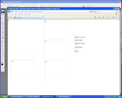
(Please see paper version in folder of this section)
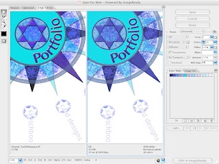
Once I had organized my designs and layout, I began to build the website. The first step was to save each element of my design for web. This converts the file from whatever format it is in to a GIF file, which is compatible for web graphics. This is because the GIF file breaks the colour down into a lower amount of groups, making the file smaller. The lower the colour groups, the more likely you are to loose some of the quality of the image. However, it also means that the image will take less time to load in the browser. I reduced the compass image on my index page from over 200 in Photoshop to 16 in the GIF. There was some loss of quality, but I felt it was minor, compared to the advantage of a site which loaded quickly.
I repeated this process for each graphic element of my website. I made sure that I created my Photoshop graphics on separate layers so that I wouldn't encounter any problems with adapting them for a website.
Below: Saving a Photoshop file for web
The next step was to create the rollover buttons. These are the links to each category of the site on the index page, and also in the submenus on each page. The rollover effects makes each link change colour when the mouse is passed over it. To do this, I saved two versions of each link for web, one as the original colour and one as a lighter version. It is very important to save the buttons at exactly the same size, otherwise the images will be unclear and the rollover will be ineffective.
Below: saving rollover buttons
I have now prepared all my images, and made sure that they were all saved in a separate folder. The next step is to define the site in Dreamweaver. This is an XHTML based software, which is fully inclusive and does not require plug-ins. The other main kind of website software is Flash. this is more animated graphics based than XHTML software, but does not work on all platforms and may take a long time to load.
I defined my site by choosing Site> Manage Sites>New>Site. I selected the Basic tab, named the site portfolio and clicked next. I then selected No I do not want to use a server technology and clicked next. I selected the edit local copies on my machine button and clicked the yellow folder icon to the right of the text box. I navigated to my portfolio folder which was located in My Documents and and clicked Select and then Next. Under the question How do you connect to the remote server I selected None from the drop down menu. I then clicked Next and Done.
To create documents within the site, I selected File>New. I then selected the General tab from the top and selected HTML from the page type window, and none from the Layout window. I selected the doc type as XHTML and clicked Create. I created a separate page for each section of my site.
In Dreamweaver, the drag and drop commands allow you to create sites without any knowledge of HTML. However, you can view the code with a split screen view. Although I used the drag and drop commands to build my website, I kept the split screen view open so I could gain a basic understanding of how the code works. The code is known as XHTML tags. The opening tag and the closing tag contain the letters html. In between these two tags, is the header and the body. The header contains information that doesn't appear on the page itself, like the title. The body contains the text and graphics that appear on the page.
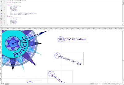
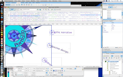
To add an image to my first page, the index page, I selected the layout category in the Insert bar, and selected Draw AP Div (second from the left.) This tool allows you to draw an image box of any size on the page. Once the box is drawn, the image can be added to the box by selecting the Common category in the Insert bar, and then the Image Icon.
Below: the code showing the first div tag, where the main compass graphic has been added.
To add the rollover buttons, I followed the same process, but chose the rollover option from the drop down box to the right of the Image Icon. To make sure the process had worked, I clicked File>Save>Preview in Browser> Camino/Safari etc. This opened the page in the selected browser and I was able to roll the mouse over each link to make sure that they changed colour.
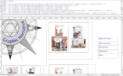
I created a new page for each category of my website, eg. Graphic Narrative, Card Designs, Sketchbook, Illustrated Book, and Magazine Design. I added the images and the rollover buttons in the submenu in the way described above.
Below: The code showing the div tags and images for the Graphic Narrative page.
The next step was to create the links between the pages. This was done by highlighting the text and image that I wanted to link. In the property inspector (located at the bottom of the dreamweaver screen) I entered the name of the file I was linking to- eg. carddesigns.html - in the link text box. I repeated the process for each link in each page, making sure that all the submenus were also linked.
A quicker way of linking documents is to use the Point to File icon. As before, you highlight the text or image that you want to link, and then click on the target icon to the right of the link text box. Holding down the mouse button, drag the pointer to the required file in the files panel and release the mouse button. This automatically adds a link in the text box.
The next thing I did was to add an animated image. I prepared the image in Image Ready. Using the line tool to create arrowheads, I drew a series of long arrows to create a needle around the centre of the compass, making sure that each arrow was on a separate layer and placed a short distance underneath the previous one. Then, using the animation facility at the bottom of the page, I added a frame for each position of the arrow, using the eye tool to hide the other arrows. Once each frame had been added, I set them to play at one second apart, to create the impression of a needle moving around the compass. I set it to play once, rather than on a continual loop, because I think on the index page where I am going to put it, it will become distracting if looped. Finally, I added it to Dreamweaver by selecting Save Optimized as and saving it my web folder. I was then able to replace the un-animated compass on my index page with the animated one. I saved it and previewed it in a browser, and it works as it should, with the needle moving around the compass once each time the page opens.
Below: creating an animated image in Image Ready
The final stage was to add a feedback form, where users could fill in boxes and send it to an email address. This was done by choosing the Form option from the insert menu. A red border appeared which marked the boundaries of the form. To set the properties so that the form can process the data it receives, I added mailto: followed by my college email address in the action field. I made sure that the method field was set to POST. This allows the data to be collected when the user clicks submit.
To add objects to the form, I highlighted the body of the form and then in the common tab clicked table. I choose the required number of columns and rows in the property inspector. I was then ready to to add text fields which allow users to type into the form. In the insert menu I chose Form Object and then Text Field. In the property inspector, I set the field name, the character width and the number of lines.
Once this was complete I added buttons. To do this, I chose Form Object and the Button from the insert menu after I had highlighted the relevant section on the form. Buttons perform tasks when they are clicked, such as submitting and resetting the form. In the property inspector, I set the name, label and action ( either to submit or reset the form.) I then saved the file and previewed it a browser.
Below: adding a form
The website was now built and everything worked in the browser preview. The next stage was to upload the website to a server and test on all browsers and platforms.
