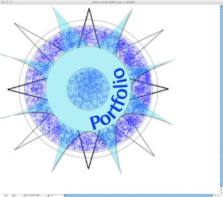
Once I had chosen my design, I set about creating the final image in Photoshop. To make sure that the shapes were of equal size and accurately spaced, I used a grid as a guide. I drew a series of concentric circles of increasing size, making sure that each one was on a separate layer, so they could be coloured and changed easily. To draw the compass points, I used the pen tool, including the anchor point tool to create curves. I also made sure that the document was saved to a suitable size for a web page, eg. 640 x 480 pixels.
Although I am planning to use just a section of the compass, I am designing it as a whole image so that I have flexibility in positioning it.
Below: screenshot of the compass drawing.

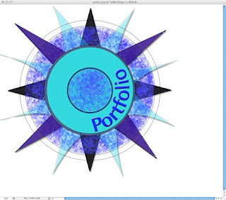
The next stage was to add colour, text and texture. I hid the grid, and used the line tool to create a curved text path within the inner circle. I then used type tool to add the word 'Portfolio' along the path. I choose quite a simple font, because too many tails and flourishes would have interfered with the lines of the curve.
I used the brush tool, with a dry brushstroke effect to add some texture around the outer circle. I chose the colours to tone with each other, ranging from turquoise to purple, as I thought too many contrasting colours would over complicate the image and distract from its purpose.
Below: screenshot of colour and texture building stage
I built up the colours in layers, making some layers semi- transparent to create extra texture. I added embossing and drop shadows to the shapes and lettering to give it a more solid appearance. (below).
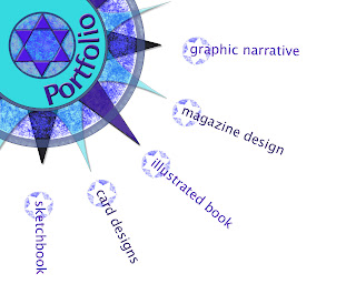
For the final version, I added a star shape in the centre for extra interest. I repositioned the image to the top left hand corner of the page and cropped it. I then arranged the links for each section of the website around each compass point. Originally, I was going to use the star shape as a button for each link, but when I came to copy and paste them, it looked too cluttered. I decided to just use the outline star shape formed in the central circle, and integrate it with the lettering, so that both image and words form the whole link.
Below: the final version of my homepage design
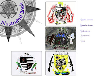
I now had to consider the inner pages of the website. I wanted to keep them as simple as possible, because the purpose of the website is to present work, not draw attention to its own design. I decided to stick with the white background and compass image, and arrange my work with a straightforward menu bar down the right hand side.
When I first tried this, I found the colours of the compass were fighting with the other colours on the page, so I changed the compass colour to grey tones using the balance and contrast options. I just kept the lettering in colour, for definition.
The categories I have chosen for the inner pages represent the strongest areas of my portfolio, and the areas I am most interested in. I felt this was the most logical approach as I may want to use the website in a professional context in the future.
Below: One of the inner pages of the website
I have now discussed the design aspects of my website, and will go on to discuss the technical aspects of building the site.
(For my Website Proposal, please see paper copy as I am unable to add the PDF file.)
No comments:
Post a Comment