How I Built my Website
Initial Designs
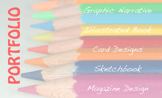
I wanted my website to look not only visually interesting, but also to communicate something about the content- which is to be a portfolio of my graphic design work to date. My first idea was to use artists materials, such as photos of squeezed tubes of paint, scribbled pencils, etc. As a quick experiment I toned down a photograph of a row of coloured pencils in Photoshop and used it as the backdrop for my home page. (Below). I like the colours, but I wanted a more distinctive image.
I took a photograph of various jars and paints etc. lined up on my desk (Below). This made the effect more interesting and personal.
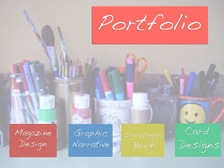
Overall however, I decided that using images of artists materials was a bit too obvious, and had probably been produced in various ways hundreds of times already. I wanted something more subtle and original.
Of the websites I researched, one of my favourites was for the illustrator Sara Fanelli. It had a quirky hand drawn look, which stood out in a maze of slick, meticulously designed sites. The text was all hand lettered, set against brightly coloured and patterned wallpaper. I thought this look might suit my portfolio, which features a lot of hand rendered illustration work, so I produced a couple of designs which tried to emulate this spirit. I made two sets of 'wallpaper' by layering a pattern over a plain colour, and then tearing away sections to create texture and contrast. For the buttons, I scanned relevant pages from my reflective journal overlaid with a hand lettered label.
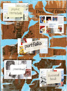
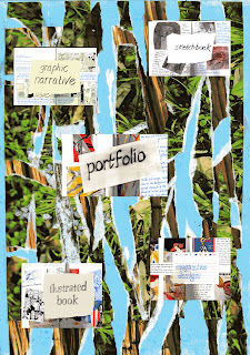
I think that my designs (above) are quite unusual, but the overall effect was rather busy; there is a little too much going on for my liking. On the pages where I would display my actual portfolio, the wallpaper would clash with the work rather than compliment it. Also I thought the overall effect was a bit 'studenty'. I decided that I would aim for a design which was more sophisticated, so if I did want to use the website in the future, I would feel it portrayed the right image.
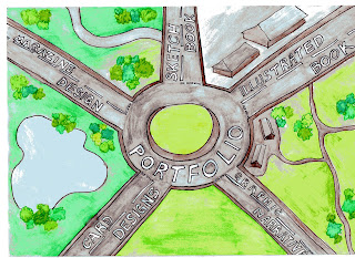
My next idea was to use a sketch of a roundabout, to convey the idea that the portfolio had one central link with categories going off in different directions, for the viewer to explore. I liked the general concept, but felt that the sketch (below) was too literal, and needed some refining.
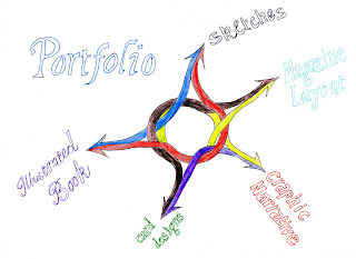
I sketched a more abstract version, while maintaining the concept of a central symbol with different tangents. (Below). However this seemed overly simple, and not particularly memorable. Also, it wouldn't work as well on the inner pages of the website where I would be displaying my work.
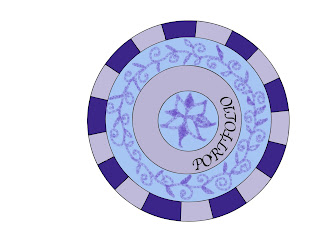
I decided that a compass would provide a more visually interesting symbol, while maintaining the same concept as the roundabout- each point will indicate a separate category. I researched some compass designs on Google images, then I created a draft version of my own design in Photoshop, using the shape drawing tools.
I built up the design in layers, so that alterations could easily be made. I experimented with various pattern and colour combinations, using a digital pen and the paint bucket tools. I tried a floral design initially, but this didn't have the more professional edge that I was aiming for. (below).
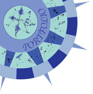
I used the 'live trace' option in illustrator, which created a much looser, more textured look. (below). I also decided to move the compass to the top left hand corner of the page, so that the same image could be used on the inside pages of the website without distracting from the work I am going to display.
I now have the basis for a final design that I am happy with. It fulfills my aim of a design which is not only aesthetically pleasing, but also has a purpose- the compass is a navigation tool, which is what the home page of my portfolio represents. There is plenty of scope to experiment with pattern, texture, tone and colour until I am completely happy with the final version, and it is also a design that can be translated to the inner pages quite easily.
No comments:
Post a Comment